Posts

Visual Analytics Final Project

Image
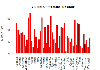
  Title: Exploring Violent Crime Rates in the United States: Insights from the USArrests Dataset Introduction Welcome to the exploration of violent crime rates in the United States using the "USArrests" dataset. In this blog post, we'll delve into the dynamics of violent crime across different states, exploring factors such as demographics, geographical patterns, and correlations between variables. Problem Statement The objective is to understand the factors influencing violent crime rates and identify patterns or trends that may exist across different states. By analyzing the "USArrests" dataset, the aim is to gain insights into the underlying drivers of violent crime in the United States. Related Work The analysis builds upon previous studies in criminology and data analytics. Similar research has explored the relationship between socio-economic factors and crime rates. We'll leverage existing visual analytics techniques, such as correlation matrices, to e

Module 13

 Creating a Simple Animation in R Introduction: In today's post, we'll explore how to create a simple animation in R using the animation package. Animation can be a powerful tool for visualizing data and conveying dynamic processes over time. Creating the Animation: We'll start by installing and loading the animation package. Then, we'll create a simple animation that plots random points with different colors. R Copy code # Install and load necessary packages install.packages("animation") library(animation) # Create animation saveGIF({   for (i in 1:10) {     plot(runif(10), ylim = 0:1, col = rainbow(10))     Sys.sleep(0.5)  # Pause for 0.5 seconds   } }, movie.name = "simple_animation.gif", interval = 0.5, ani.width = 600, ani.height = 400) Discussion: The animation consists of 10 frames, each displaying 10 random points between 0 and 1 on the y-axis. Different colors are assigned to the points using the rainbow() function. A pause of 0.5 seconds be

Module 12

  Creating Visual Social Network Analysis with RStudio  Introduction: In this blog post, we'll explore how to create a visual social network analysis using RStudio, a popular integrated development environment (IDE) for the R programming language. Visualizing social networks can provide valuable insights into the structure and connections within a network, making it easier to analyze and interpret complex relationships. Step 1: Install Necessary Packages: Before we begin, make sure you have the necessary packages installed. In RStudio, you can install packages using the install.packages() function. We'll need the following packages: GGally, network, sna, and ggplot2. R install.packages("GGally") install.packages("network") install.packages("sna") install.packages("ggplot2") Step 2: Load Required Libraries: Once the packages are installed, load them into your RStudio session using the library() function. R Copy code library(GGally) library

Module 11

Image
Module 11  ```R # Load necessary library library(ggplot2) # Define data x <- 1967:1977 y <- c(0.5, 1.8, 4.6, 5.3, 5.3, 5.7, 5.4, 5, 5.5, 6, 5) # Create data frame data <- data.frame(x = x, y = y) # Create dot-dash plot using ggplot2 ggplot(data, aes(x = x, y = y)) +   geom_point() +  # Add points   geom_line(linetype = "dashed") +  # Add dashed lines   labs(x = "", y = "Per capita budget expenditures in constant dollars") +  # Labels   theme_minimal() +  # Minimal theme   theme(axis.text.x = element_text(family = "serif"),  # Set x-axis font         axis.text.y = element_text(family = "serif"))  # Set y-axis font ``` This code will generate a dot-dash plot using ggplot2, with dots representing each data point and dashed lines connecting them. The x-axis represents the years from 1967 to 1977, and the y-axis represents the per capita budget expenditures in constant dollars. Adjustments to the font family are made to ensure the t

Module 10

  Exploring Time Series Data Visualization with ggplot2 In this blog post, I will explore the visualization of time series data using ggplot2, a powerful data visualization package in R. Time series data represents observations collected or recorded at different points in time, making it essential for analyzing trends, patterns, and relationships over time. 1. Hot Dog Eating Contest Results Visualization The first example focuses on visualizing the results of Nathan's Hot Dog Eating Contest from 1980 to 2010. We start by loading the data and examining the first few rows: ```R hotdogs <- read_csv("http://datasets.flowingdata.com/hot-dog-contest-winners.csv") head(hotdogs) ``` Next, we create a bar plot using R-base graphics to display the number of hot dogs and buns eaten each year, with different colors indicating whether a new record was set: ```R colors <- ifelse(hotdogs$New.record == 1, "darkred", "grey") barplot(hotdogs$Dogs.eaten, names.arg

Module 8 Assignment

Image
Correlation Analysis and ggplot2  Download the mtcars data set from the R datasets package using the following code: ```R data(mtcars) ```  Once you have the data set loaded, you can generate correlation analysis using the `cor()` function to calculate the correlation matrix: ```R correlation_matrix <- cor(mtcars) ``` Then, you can visualize the correlation matrix using ggplot2 and the `geom_tile()` function to create a heatmap: ```R library(ggplot2) # Convert correlation matrix to long format correlation_long <- reshape2::melt(correlation_matrix) # Plot correlation heatmap ggplot(correlation_long, aes(x = Var1, y = Var2, fill = value)) +   geom_tile() +   scale_fill_gradient2(low = "blue", high = "red", mid = "white",                         midpoint = 0, limit = c(-1,1),                        name = "Correlation") +   theme_minimal() +   labs(title = "Correlation Heatmap of mtcars Variables") ``` After generating the visualizat

Module 7 Assignment

Image
  For this assignment, I chose to analyze the distribution of the mtcars dataset, which is readily available in R. The mtcars dataset contains information about various characteristics of different car models, such as miles per gallon (mpg), number of cylinders (cyl), and horsepower (hp), among others. To start, I imported the mtcars dataset into RStudio using the following code: R ``` data(mtcars) ``` Next, I performed a distribution analysis on three variables from the mtcars dataset: mpg, cyl, and hp. I used histograms to visualize the distribution of each variable individually and then created a grid of histograms to compare their distributions side by side. Here's the R code to create the grid of histograms: R ``` # Load necessary libraries library(gridExtra) # Create histograms for each variable mpg_hist <- hist(mtcars$mpg, main = "Distribution of MPG", xlab = "MPG", col = "lightblue") cyl_hist <- hist(mtcars$cyl, main = "Distribution